Last Week in Search: Google Updates iPad App, Culls More Products and Launches New YouTube
Did Google just sneak Chrome OS onto the iPad?
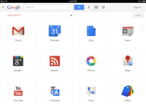
Google launched a significant redesign of its Google Search iOS app last week that brings a whole suite of new features to Google’s flagship iOS app. Touting the new app as more interactive, visual and easy to use, Google have also designed an Applications screen within the search app that provides access to Google’s suite of web-based products. With Gmail, Calendar, News, Google+, Reader and even products with existing iOS apps such as YouTube and Maps available from the Applications springboard, Google have essentially snuck the barebones of their Chrome OS into the Google search iOS app. It’s an interesting move from Google, but one that many will find lacking once they begin using the horribly uninspiring web interfaces Google provide to mobile users of their products.

Google culls more dusty products
Google took to its official blog Tuesday morning to announce a third round of Google product cuts. On the chopping block this round was Google Bookmarks Lists, Google Friend Connect, Google Gears, Google Search Timeline and most prominently Google Wave and Knol. Google Wave is a precursor of the Google+ project that failed to gain widespread interest and had its development halted only months after launching to the public whereas Knol was Google’s failed answer to Wikipedia that allowed monetisation of articles by their author. More product cuts are expected to follow as Google trims the fat from acquisitions made over the last few years.
Unlock YouTube’s New Design
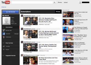
YouTube’s new design began rolling out to users last week with a slew of new features and a fresh coat of paint. But in typical Google fashion the rollout to users has been slow. If you haven’t got access yet check out our quick tutorial on how to activate the YouTube redesign here. With all new social integration with Google+, Twitter and Google+, redesigned trending features and more prominent reliance on channels, the new YouTube lines up with Google’s intent to turn the online video network into a content creation machine. Give the new YouTube design a try and let us know what you think in the comments!

Google talks personalised search
Google Fellow Amit Singhal took to Google’s Inside Search blog to talk about Google’s philosophy on search result personalisation. The post is a great introduction into how and why Google personalises search results, also giving some insight into the future of search personalisation straight from the horse’s mouth. It’s a bit of a long one but well worth the read to gain some understanding into how social signals are fast becoming integral to the relevancy of search results. First they were awfully chatty about ten recent algorithm changes and now they’re talking about how they personalize your search results. Is it just me or is the Google search team getting a lot friendlier?

How to build your own video content
You’ve heard it time and time again, but it’s true, content is king. With Google’s fresh content algorithm change a few weeks ago the slogan rings even truer. But for many businesses creating compelling, sharable articles can be time-consuming, costly and hard to scale. But just like we do every week with Jim’s show, video content is easy to create, quick to produce and allows you to do what you do best: talk about your business and industry. Check out Jim’s show below for a look at the gear we use and how to get started creating video content for your business.
That’s it for Last Week in Search. Drop us a line in the comments or on Twitter @StewArtMedia!

Jim’s been here for a while, you know who he is.


