Twitter Reveals New Design
 Twitter announced a major design overhaul earlier this morning, ditching their current dual-panel design for a simpler and easier to use interface.
While the ‘New Twitter’ design that debuted last year tried to pack everything into one place, the redesign unveiled today targets the different types of users on the popular microblogging service. Power users who use Twitter as their news feed and will feel even more at home with the updated home screen, while those that prefer to socialize on Twitter will be stuck to the newly revamped connect page. Recognising Twitter’s transformation into a content delivery platform, a new ‘Discovery’ page built around trending topics and stories will further cater to those using Twitter as the instant news source that it has become.
Here’s a quick rundown of the features found on each of the new Twitter dashboards:
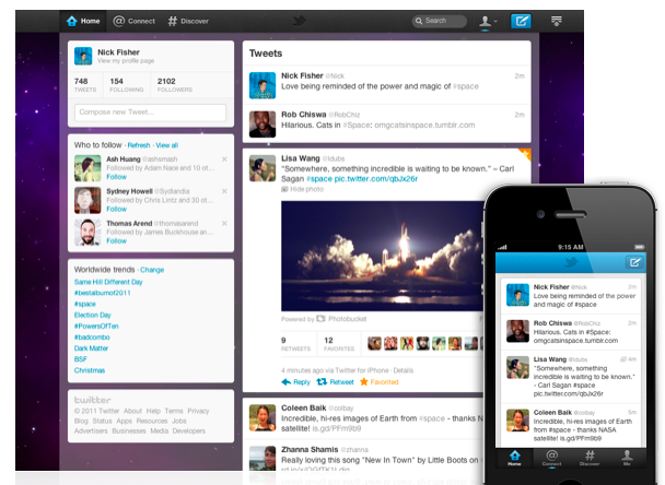
Home
- The home screen is relatively unchanged from Twitter’s previous iterations apart from the spacious and simplified redesign. The new interface is most noticeable on the home screen, where the previous dual-pane layout is dismissed in favor of an expandable in-line system for tweet details such as replies, retweets and multimedia links.

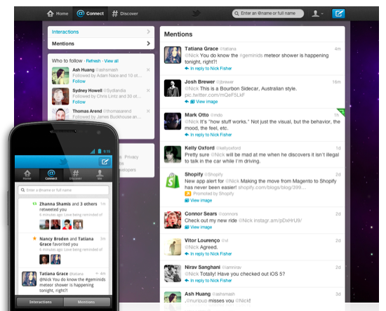
Connect
- The connect page builds on the ‘Activity’ stream Twitter revealed a few months ago. The connect dashboard builds all mentions, retweets, favorites, interactions and activities into one easy digest that makes Twitter far more social than ever before.

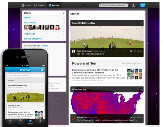
Discover
- The discover panel turns trending topics into a full blown content delivery system that draws upon Twitters reputation as an up-to-the-minute news wheel. Popular stories and trending topics will be featured on the discover dashboard, making it easier to see what’s going on in the Twitterverse and contribute to the news as it unfolds. The discover panel also makes it easier to find friends and users with common interests to follow.

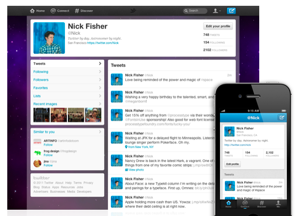
Me
- Your profile will now be found under the Me panel, which has undergone the biggest facelift. A top banner now displays your biography, profile picture, information, links and statistics, focusing the profile back on Tweets that would often go ignored on the profile page with the often-cluttered previous design. Profiles are cleaner and easier to navigate than before, while Direct Messages seem to have taken a backseat to more public communication.

A Unified Twitter Experience
In addition to the new categories, Twitter is also readying a unified experience for Twitter across its strong suite of mobile and desktop. Twitter pushed out early updates to iPhone and Android users with the new design this morning, promising refreshes to not only their iPad and desktop apps, but also acquired third-party apps such as the popular TweetDeck.
Twitter will also pick up right where you last stopped reading your feed, regardless of the device you use. Your Twitter account will be synced across all of your Twitter apps with the changes, meaning no scrolling through days of already read tweets when accessing Twitter from mobile devices. It’s a small change that makes a big difference when using Twitter on the go.
Twitter says the change will be rolling out to users “over the next few weeks” but if you’re anxious to see what the changes feel like, head to your smartphones app store and pick up Twitter 4.0 for a sneak peek.
What do you guys think of Twitter’s big changes? Leave us a comment below!

Jim’s been here for a while, you know who he is.


