Sliders Kill Conversions
Welcome back Rankers! I wanted to talk to you this week about conversion rate optimisation. It’s something that we’ve always had people on our team doing, but there’s always been a debate about a feature called sliders.
Conflicting Opinions
There was an article this week from Mr. Yoast himself, and he said, in no uncertain terms, that, “Sliders suck!” He wrote an awesome blog post with lots of supporting data from some incredible people who I respect when they are talking about conversion rate optimisation. Tim Ash is quoted in there, and I’ve known Tim for several years now, and he’s been saying to me for quite a while that sliders do indeed suck and we should all do away with them.
I then met this bloke over in Russia, Tim Stewart. Another Tim. I’m not sure if you have to be called Tim to conduct conversion rate optimisation. Maybe I’ll adjust the first letter of my name slightly. He also said the same thing, about sliders, not changing my name. With sliders, the first one typically gets all the clicks and the second doesn’t get any.
Other people came out to say that Neil Patel, a well-known digital marketer and publisher of content, came out with a video that said that sliders were okay. That was also last week. I thought that was quite odd. So I went and checked out his video.
It says, “Should you use sliders on your website?” He goes on to say yes. His version of a slider is something that slides out from the side of the screen. A pop up essentially, but just while you are reading. We’re not talking about the same thing when Neil talks about sliders as pop ups. When we talk about pop ups we are talking about something like this.

This is arguably one of Australia’s most popular ecommerce sites, and you can see they have this big thing at the top that keeps changing. That’s what we call a slider. The problem with them and this is my understanding from people I’ve spoken to, is that if I hit that thing and I’m not after that phone by Google for example? What if I’m not here for the computer they are displaying? What if I’m only here to buy something specific? You’re presenting all this information on the most valuable real estate of your homepage. You are delivering a message to someone who may not want to hear it. So, that’s the problem with sliders. Then they keep changing.
Sliders Damage SEO
The problem from my perspective with sliders is the speed shackles that it adds because every one of the images is something else the user has to download. Slowing your page load time, and as we’ve discussed, that’s a killer. Speed is probably our major focus now, as an issue with sites, especially eCommerce sites. We did a little exercise, and we don’t have a lot of data on this yet, but we’re not fond of sliders and we tell our clients to remove them. Many clients love their sliders and are adamant that’s where they have to put their sales information, clearance sales, and all those sorts of things. A lot of retailers see it as their shop window, trying to attract people in. The thing is, people are already in your store when they see your homepage. The aim should be to get them their requested information as fast as possible.
Speed is important on so many different levels. We know that 40% of traffic will hit the ‘Back’ button if your page takes longer than three seconds to load. That in itself is an important consideration alone when thinking about implementing a slider. You will have to add more real estate to the homepage. The other thing that we know with ranking and with traffic from Google, is that we talk about Panda and quality, where content is on the page, and all the rest of it. What we know is that if you are a retailer, having a slider at the top of your page will hurt your rankings.
Now JB Hi-Fi has got a massive brand, and so in Australia they wouldn’t have to worry too much about these sorts of subtleties. But, if you are a smaller retailer with a smaller brand, I would highly recommend removing anything above the fold that is hampering the ability of the user to reach the product information as quickly as possible.
With bloggers it’s different. We want them to have content at the top of the page. We don’t want ads. We don’t necessarily want sliders either. For instance, we have one retail client in particular that has lots of content at the category level page. Let’s say ‘black boots’ might be the category. Then they might have a couple of paragraphs as a sales spiel on how good black boots are. The problem with that for a retailer’s site is that the user isn’t there to read about black boots, they are there to buy the black boots product. So you need to make it as easy for them as possible to reach those products in the fastest time possible.
If you are a blogger and you have product information, e-books, or whatever, at the top of your page and people aren’t necessarily there to see that information, then we know from Panda that if you have ads, or clutter, or if people have to scroll down to find your content, then you’re probably going to rank a little lower as people can’t get to that information as quickly as they need to. Different types of sites will have different rules as far as Google goes, or will have different signals as far as Google goes. The one thing that is clear is that you have to make it as easy as you possible can for users to get to the information they want. Having a slider will slow that down.
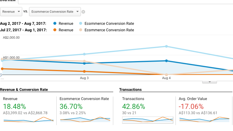
Slider Test Case
So here’s what we did during the week. This site is for a small retailer and not a massive brand for the category. We’re only talking of a period of around five days. Not a lot of data as I mentioned. They had a 34% increase in conversions which is not too shabby and organic has shown the best results so far.
This probably won’t be as pronounced over the next month, but we’ll bring you some data back on that. We are quick to tell clients that we’re not overly happy with sliders, but for the most part they are always happy with them! They are often called carousels and the debate will rage on about them. Anyway, have a look at the article and check out many of the other articles out there that discuss why these sliders slow the process down for the user and are rubbish.
If you’ve had a different experience and you love sliders, either from a site owner’s or user’s perspective, please let us know. I’d love to hear contrary stories as to why sliders work. We’ve had people in the office who claim to love sliders on certain types of sites. (Namely our Content Manager who loves them when he’s adding to his toy collection!)
Hopefully that’s helpful. If this has been any use to you at all, or if the show in general has been of any help, please share it with your friends and neighbours. Remember, the best way to stay in touch with us and keep up to date is to subscribe to our YouTube channel, which is /jimboot. We’ll see you all next week. Bye!

Jim’s been here for a while, you know who he is.