Mobile sites can hurt SEO
It wasn’t that long ago that google was telling us we should use a sub domain for our mobile sites. Here’s Matt Cutts banging on about the benefits of using m dot for the mobile version of your site.
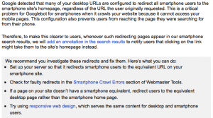
Then about a year later they began saying we’d prefer it if you used responsive design as it was easier for their bots and algorithms. Then just over a year ago we saw the smart phone and feature phone tabs turn up in the crawl errors section of webmaster tools. Just a few short weeks ago we saw one of our clients get this message.

The problem is that the m dot version of the site is a cut down version of the main site. Google indexes and ranks the desktop version and then displays it in it’s mobile search results. A user clicks on this result using their mobile and gets redirected to the the m dot version. Google is now classifying this as a “faulty redirect” as detailed in this blog post.
Get rid of your M dot.
If you do have a separate sub domain for mobile the quickest fix is to get rid of it. Just switch to a mobile responsive version of your site.
Smart phone or Feature phone?
A smart phone is essentially the main mobile device that will visit most websites. It includes Android devices and iphones. I wouldn’t worry too much about feature phone crawl errors unless you have a large amount of traffic from them.

Jim’s been here for a while, you know who he is.


