Google Ditches the Black Bar, Internet Sighs in Relief
I still remember that fateful morning when I typed Google.com into my address bar and came face to face with Google’s black navigation bar. I instantly hated it.

It shrouded my screen with darkness, threw off the squeaky-clean design Google was known for and kept telling me about this new thing called Google+ like I really needed another social network. For a split second I vowed to switch my search engine to Bing before remembering that Bing sucks and that for better or worse, I was betrothed to Google.
So I dealt with it and reluctantly made friends with the black nav bar. It’s been a rocky road, but since that fateful morning the black bar and I have become reluctant colleagues. We work with each other, but that doesn’t necessarily mean we have to like each other. The black bar was like that less attractive girl you pretend to like just to get at her better looking friends.
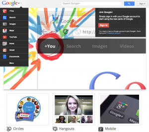
It seems like someone at Google agreed with my reluctance to accept friendship with an inanimate search engine object, as yesterday Google unveiled a new navigation system that ditches the black bar for a clean new rollover navigation system.
Check out Google’s introduction to their new navigation system below:
While I have yet to be introduced to the new nav bar thanks to Google’s slack introduction skills slow rollout process, we should be seeing the new and improved navigation bar on searches sometime soon. Take a look at Google’s introduction in the video below.
RIP the Google Black Nav Bar. You will definitely not be missed.
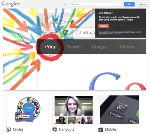
UPDATE: Our new Google Navigation just went live. It’s real pretty. Thanks Google. Here’s the caps we got from the Google+ login screen. Still wasn’t enabled on search.


Jim’s been here for a while, you know who he is.


