Facebook’s iPad App: the Good, the Bad & its Rocky Road to the iPad.
 Facebook has finally taken the wraps off of its long awaited iPad app after months of rumor and speculation. Facebook for iOS 4.0 brings a host of updates including a new user interface, app support, security improvements and the highly awaited universal support that brings it all into HD on the iPad.
Facebook’s route to the iPad has been a rocky one, letting the cat out of the bag when Computer Engineering student Marvin Bernal found it hiding inside the Facebook iPhone app. All it took was a single line of code change and jailbroken iPad’s had access to Facebook’s then-unreleased iPad app from the freely available iPhone version.
After patching up the leaks, the lead developer of Facebook’s iPad app blasted his now former employer after moving on to Google for constantly delaying the app despite being feature complete since the second quarter of this year. Reports of a heavily strained relationship between Facebook and Apple further scuttled any hopes of an iPad Facebook offering until late last month, when the two tech giants kissed and made up. Mashable then reported Facebook would announce the iPad app at Apple’s ‘Let’s Talk iPhone’ event last week, but once again the release never came to fruition.
Less than a week later, Facebook’s iPad app has finally landed on the iOS App Store. Here’s the good, the bad and what we wish Facebook had done differently.
The Good
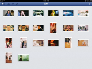
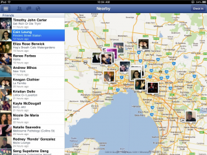
The biggest benefit of Facebook’s new iPad app is finally having a touch-optimised Facebook interface. While Facebook in Safari was adequate, the lack of chat, awkward iPad navigation and the hassle of having to continually access the site through Safari made Facebook’s iPad experience suffer. The execution of Photos is flawless, making Facebook’s iPad app the best way to view your friend’s photos. The camera-inside-app feature is also something I’ve never seen implemented in an iOS app before and works a treat. The ‘Nearby’ tab is also a great way to see what’s going on around you on Facebook. The app has a cleanly designed interface and runs incredibly quick on my iPad 2. Most impressive of all, Facebook has managed to bundle it’s group of services together into a great mobile experience without going overboard with features like it tends to on its website iteration.
The Bad
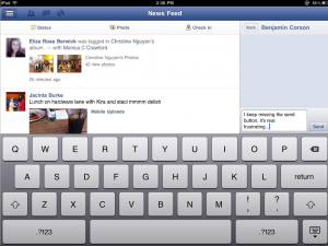
For an app that’s been in development this long it’s surprising to see so many bugs in only our first few hours of testing. We ran into quite a few weird design issues where objects would float where they shouldn’t be. While it’s easy to reconfigure, the small annoyances begin to pile up. The multiple ways to message can get confusing quick, especially when the app decides your chat is actually a message and begins displaying notifications for messages you’re reading in chat. We also weren’t able to turn down the message notification noise, which got old really quick. The news feed feels bare and the omission of the ticker has to leave you scratching your head, especially when most people use iPad’s as a social oriented second screen.
Wish List
- Separation of chat & messages for accurate notifications
- Dedicated ticker app
- Insights for Pages
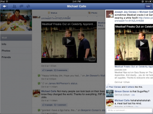
- A bigger comment sidebar
The Verdict
Make no mistake though, Facebook’s entry into the tablet space is a huge success and will likely result in millions more iPad sales for Apple. As the only tablet device currently with an official Facebook app, the iPad is now properly situated to dominate as a social networking device. While the app lacks the polish of say Twitter’s native iPad app, Facebook have done a great job to deliver a product that ties their services together into an excellent mobile social networking experience.
Grab Facebook’s new universal iOS app here and let us know what you think!

Jim’s been here for a while, you know who he is.


